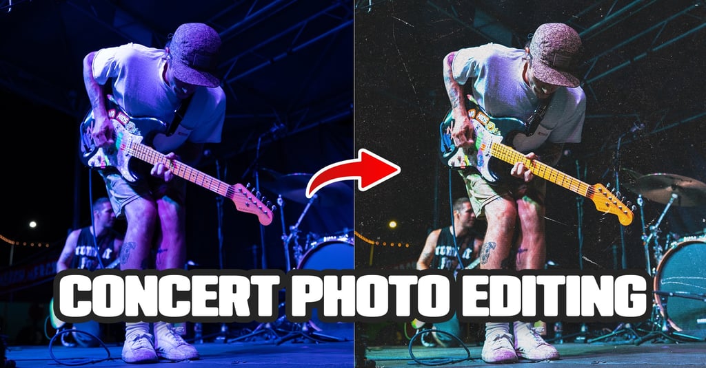
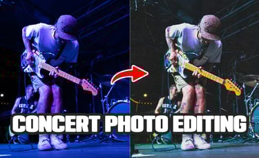
How I Edit Concert Photos in Adobe Lightroom (Step-by-Step Guide)
A walkthrough of how I edit concert photos in Adobe Lightroom. From basic light correction to color grading and effects, to help capture the energy and emotion of live shows.
TUTORIAL
Concert photos are a style of photography that is often heavily stylized, which can make getting into it a little tricky. It's more than just capturing what’s physically there, but translating the atmosphere, energy and emotion into something the viewer can feel just from seeing it.
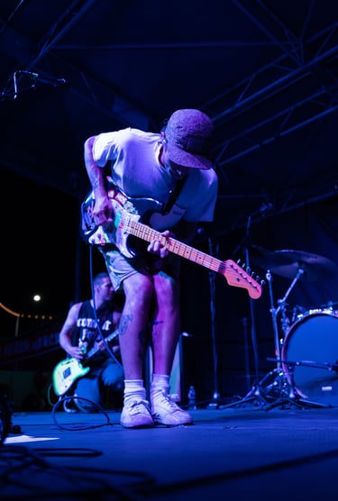
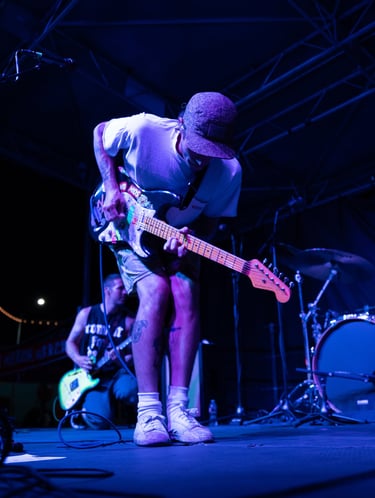
In this post, I’ll go over how I like to edit my concert photos in Adobe Lightroom, step by step. The example I’m using is a RAW file from a Mom Jeans show I shot recently. Here’s what the original looks like:
Step 1: Basic Light and Color Correction
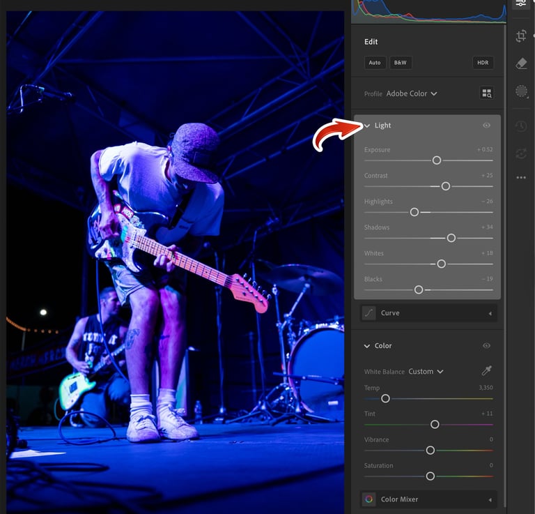
Light
Before messing with colors or effects, you need a solid base to build from. I usually start with the contrast slider, bringing it up to around +30. It’s a quick and easy way to get more pop in the image, but it doesn’t fix the balance, that’s where the other light sliders come in.
To keep the image detailed and not too harsh, I usually set things around here:
Highlights: 0 to -60
Shadows: 0 to +30
Whites: 0 to +25
Blacks: 0 to -25
Highlights are probably the most variable, depending on how dramatic the lighting is. With Highlights and Shadows, you want to adjust them so you still get a little bit of detail in the brightest brights and darkest darks. Adjusting Whites up and Blacks down adds some more contrast
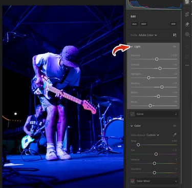
White Balance
Next, I adjust the white balance, which can sometimes not look like what the stage does in person. This photo is an extreme example, with the lighting being super blue, so I pushed the temperature and tint toward the yellow and green sides to make skin tones look natural. It’s almost maxed out on both sliders, but he doesn’t look like a smurf anymore.
Once that’s good, I add some vibrance to bring some separation to the colors.
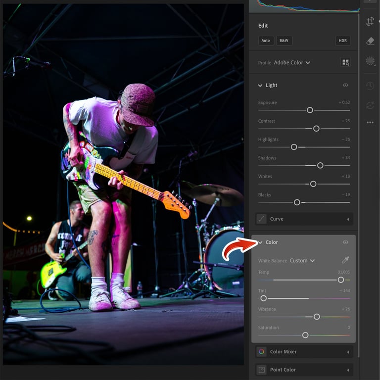

Step 2: Color
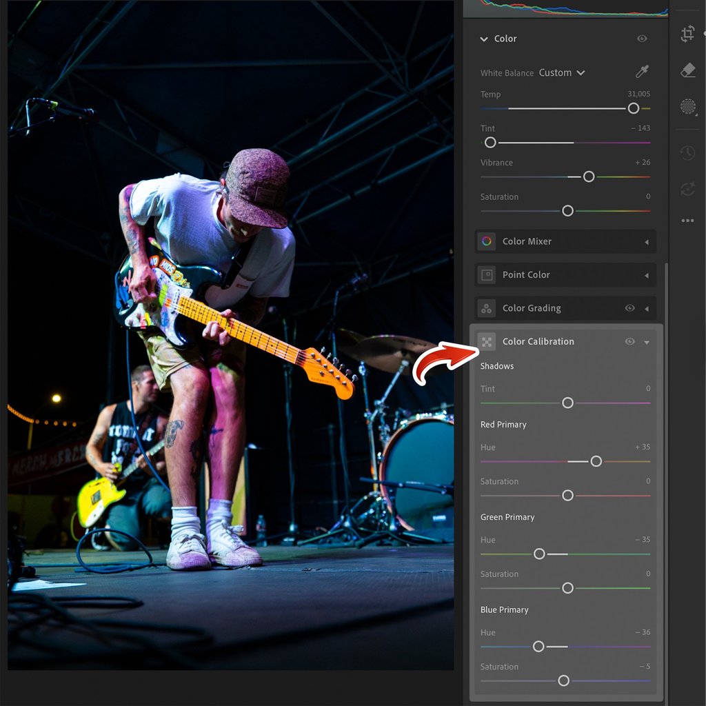
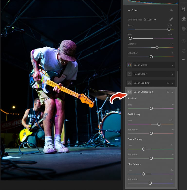
Color Calibration
In Lightroom Classic, the Color Calibration panel should already be visible. If you’re in Lightroom CC, click the three dots on the right toolbar and enable “Show Color Calibration.”
This panel is where I start building the overall look of the photo. I like pushing the red and green primaries warmer and the blue primaries cooler. Doing this makes the colors more complementary (teal and orange), adding contrast.
If you have a really magenta image, even after white balancing and adjusting the calibration like this, usually pushing the red primary further right and turning saturation down a little helps.
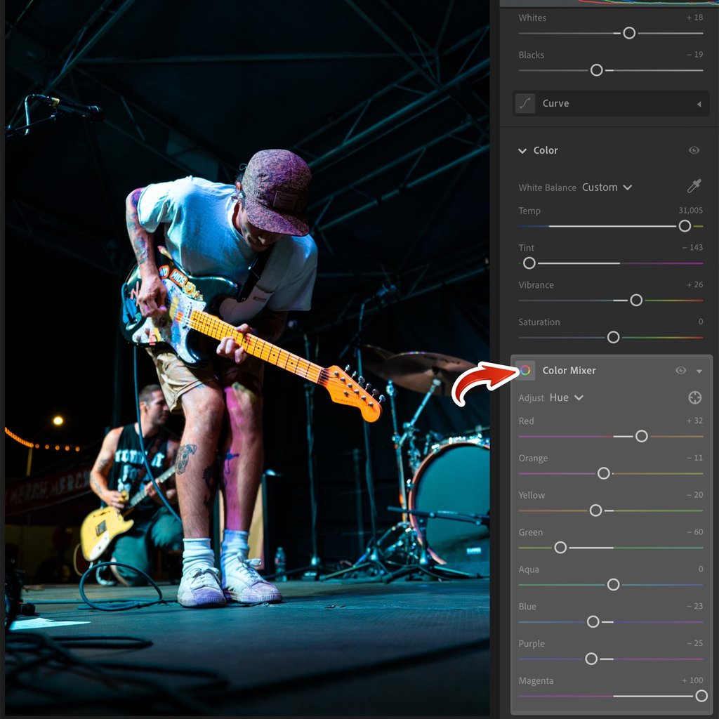
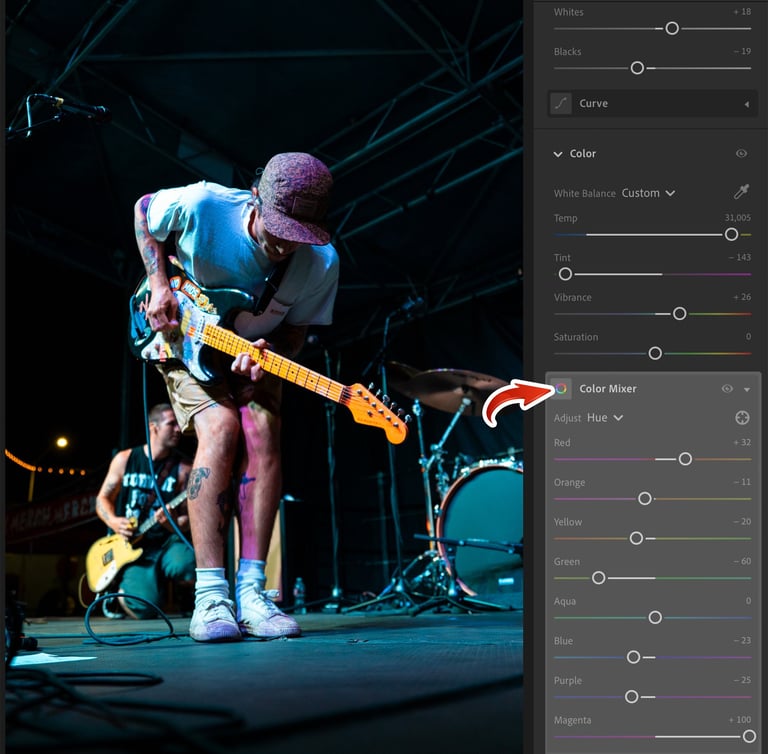
Color Mixer / HSL
Next, I go into the Color Mixer panel. (HSL in Classic) Here I adjust most of the hues to their warmer sides to emphasize the teal and orange theme.
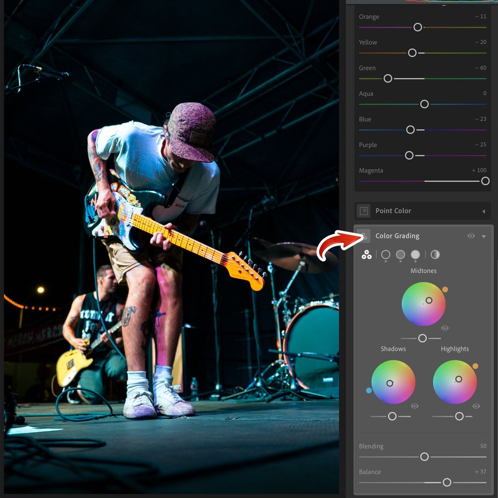
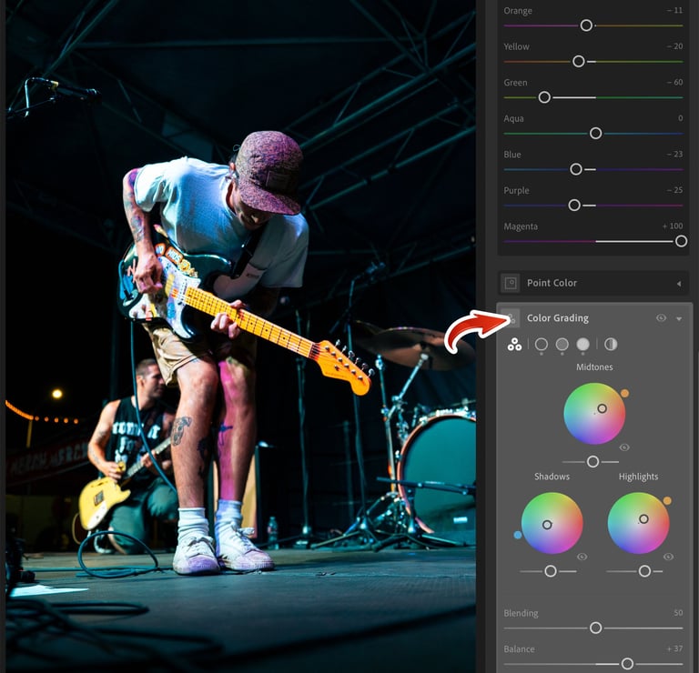
Color Grading
I continue with the teal and orange in this step.
I usually do:
Shadows: teal near center
Midtones: orange near center
Highlights: orange near center (or teal depending on how warm the skin is already)
It gives the image that nice cinematic balance while keeping skin tones looking natural.
Step 3: Curves and Effects
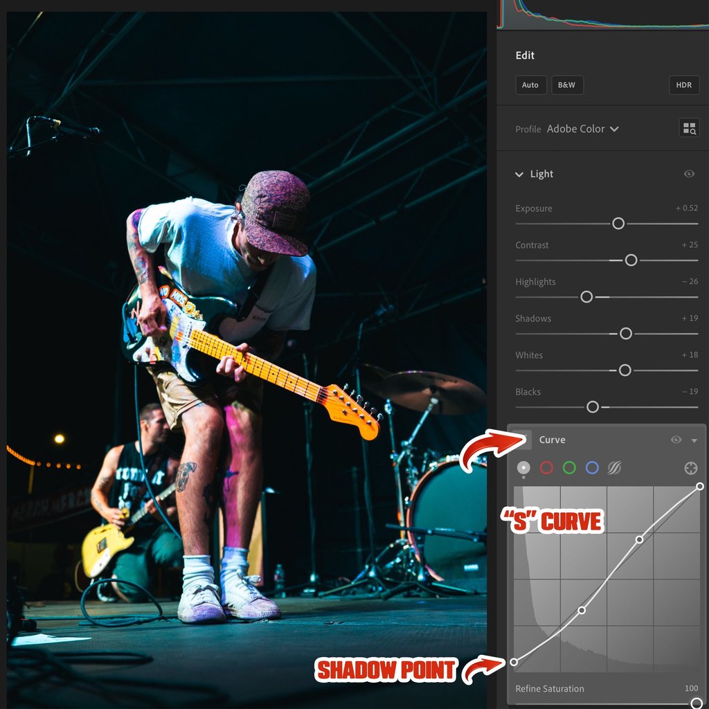
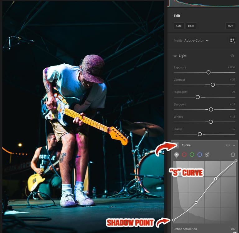
Curves
The Tone Curve is another easy way to add contrast and style. I make a light S-curve by pulling darks down a little in the bottom left, and pushing lights up in the top right. I then raise the shadow point (bottom left corner node) up some to get a soft, faded film look.
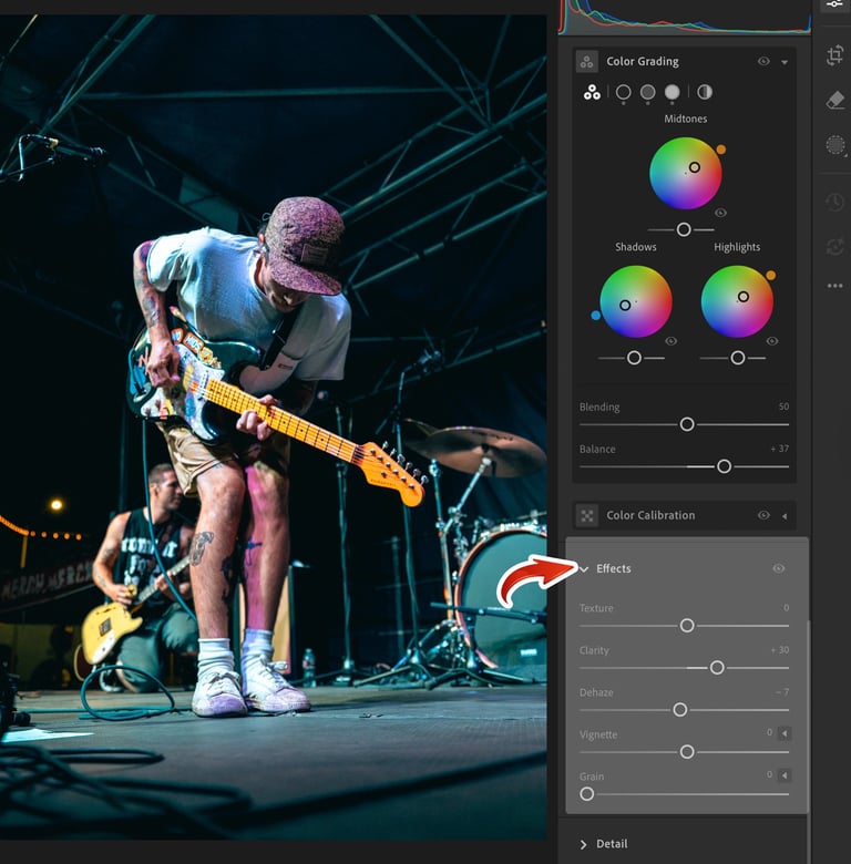
Effects
This part is all personal preference and what you think looks cool. I like adding around +30 clarity for extra sharpness and contrast and -5 dehaze to soften the image slightly. Another combo I sometimes use is adding +30 texture and -30 clarity. This gives the image a hazy atmosphere, but keeps it crisp.

Step 4: The Final Image
And here’s the final shot!
If you want to go even further, you can layer in some grunge or paper textures in Photoshop. It’s a cool way to add a bit of texture and atmosphere to your edit. I usually find mine from Texturelabs.org, it’s a great site for free textures and ideas.
Different shows have different lighting and stage setups that will make your photos look different, but this is my "default" look that I try to get if I don't try messing with other looks or effects. Its always fun to experiment!
Let me know what you think of my process, if it helped you with anything in Lightroom or if you have any tips of your own!


If you want to try this look out, download this preset I made:
Music
Exploring Fresno's vibrant local music scene.
Connect
Discover
Contact@setlistmedia.com
© 2025. All rights reserved.